
Thoughtful and considered
Creative Web Design
A good website should feel easy to use from the first interaction. Clear, considered, and built around how people naturally browse and make decisions. We design websites that balance visual appeal with usability, helping guide users towards the actions that matter.

Designed around real user behaviour
Every project starts with understanding how your audience thinks and what they’re trying to achieve. Not just broadly, but in the small details. How they search. What they look for first. What might slow them down.
That insight shapes the structure of the website, from page layouts to navigation and key interactions. The aim is to make everything feel intuative, without over-explaining.
A structured process
We follow a clear process that keeps things focused and easy to follow.
Discovery
Understanding your business, your audience, and your goals.
UX planning and Wireframes
Mapping out user journeys, page structure, and key interactions.
Visual design
Creating detailed layouts in Figma that show exactly how your website will look and feel.
Refinement
Working through feedback and fine-tuning the details until everything feels right.
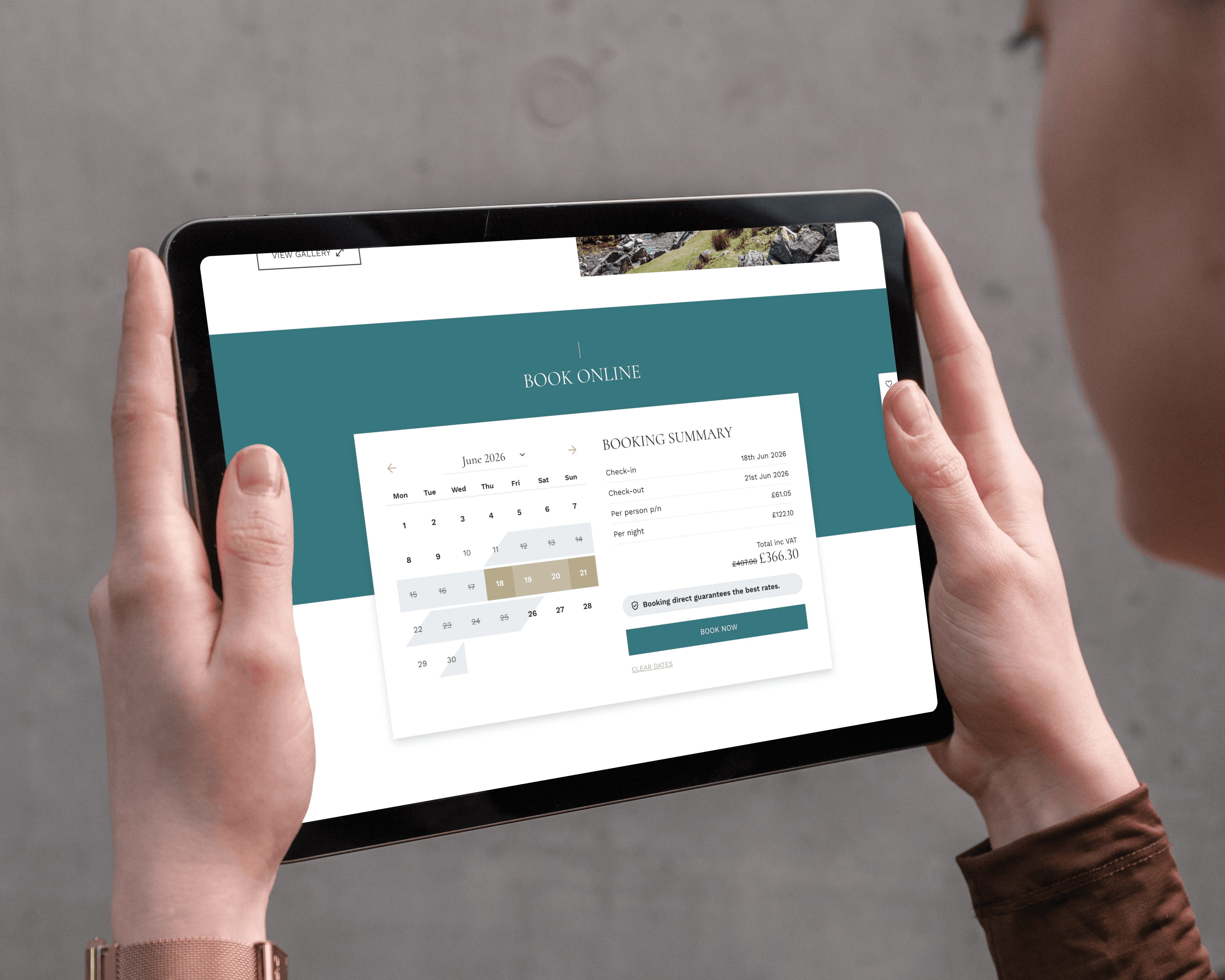
Design that supports conversion
Design decisions have a direct impact on how people use your website.
Clear layouts, well-placed calls to action, and a logical flow all help reduce friction and keep users moving forward. It’s rarely one big change that makes the difference. More often, it’s a series of small improvements that together lead to better engagement and stronger conversion rates.
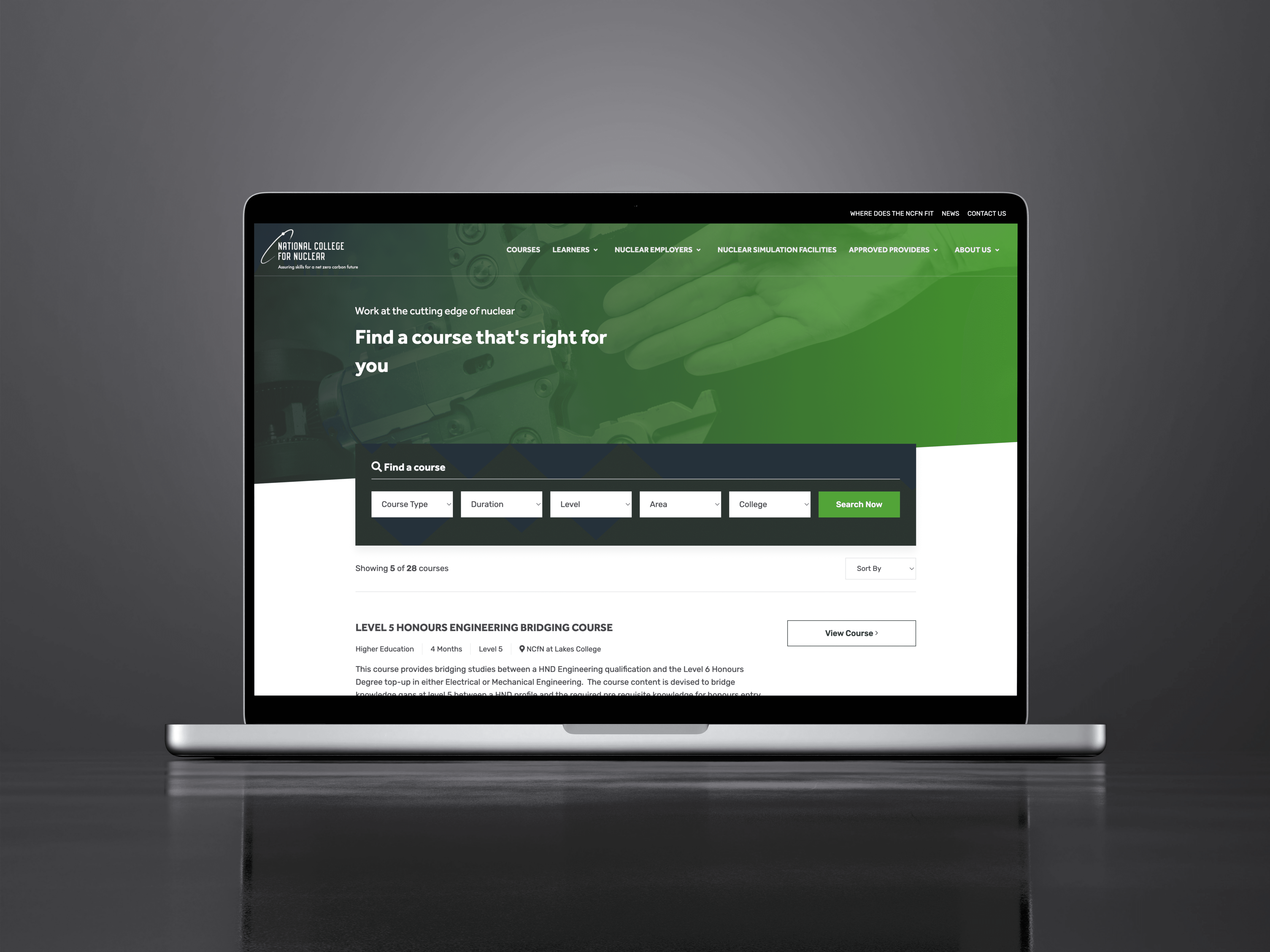
Consistency across every device
Your website needs to work just as well on mobile as it does on desktop.
We design responsively from the start, making sure layouts adapt naturally across different screen sizes, navigation stays clear, content remains easy to read, and key actions are always within reach.
It should feel consistent, wherever it’s viewed.


Working closely with development
Design and development are closely linked. Decisions made at the design stage affect performance, usability, and how easily the site can be built and maintained.
By working closely with our development team, we make sure designs are not just visually strong, but practical and efficient to build. This leads to better results overall, even if it’s not always something you notice straight away.
Featured Work
From local brands to growing national platforms, we create websites that combine thoughtful design, technical performance, and measurable results.


Let's work together
We'll make a great team